Lab Instructions: El Niño
Signature of ENSO dynamics in the tropical Pacific ocean
The ocean heats and cools the atmosphere right where they meet -- therefore,
one indicator of the effect of changes in ocean dynamics upon the atmosphere
is through sea surface temperature (SST). Since we are interested in departure
of sea surface temperature from the typical annual cycle, we look at SST anomalies.
By anomalies, we mean the difference between the SST measured that month (e.g.
September of 1997) and the averaged SST for all Septembers for which we have
data; in the case of the data below, it is January 1970-September 1998.
What is the pattern of SST anomalies in the tropical Pacific during an El
Nino event? Use the viewer
to look at an animation of monthly SST anomalies. Take note of the latitudinal
and longitudinal range of the map view here. Go to the white box above the
SST anomaly map and type in "January 1970 to Sep 1998" and click on the redraw
button to the left. You will see a progression of SST anomaly maps drawn,
starting from January 1970 and continuing to the present. Concentrate on the
largest spatial-scale anomaly patterns that you see. Hit "Stop" on the Netscape
browser to stop the animation.
Describe the pattern of SST anomalies across the tropical Pacific.
Where are the anomalies the largest? What is the typical range of the anomalies
in degrees? What is their amplitude? When during the year do anomalies start
to develop? How long do the ENSO events tend to last? Do all the events you
observe look the same, or are there differences in the timing, duration and
strength of events?
Now consider the regularity of ENSO warm phase events. One way to do so
is via a time vs. longitude plot of SST anomalies. Using the viewer, make
a time vs. longitude plot for SST anomaly data right on the Equator. Make
sure that the viewer is at 0 degrees (the default is 29°S).
Can you pick out the signatures of the main ENSO warm phase events?
How much time passes between events? Is this time interval constant,
or does it vary?
Finally, let's look at December 1982 - February 1983 averaged sea surface temperature (not anomaly).
This is during a recent strong ENSO warm phase event.
Where is SST the warmest? How does the area of the Pacific covered by
the warmest SST change during ENSO warm phase events? How does the
location of the warmest SST compare to the location of the largest SST
anomaly during ENSO events? Keep this comparison in mind as we look at
how the atmosphere reacts to ENSO warm phase conditions.
The effect of ENSO on the tropical atmosphere
During warm phase of ENSO, the atmosphere in the tropics is heated via increased
SST, so the atmosphere must respond and distribute the extra heating. It does
so via enhanced convective activity. One way we can observe changes in convection
is via satellite observations of the outgoing longwave radiation (OLR). The
OLR measurement tells us the temperature of the surface that the satellite
sees. If the atmosphere between the satellite and the Earth's surface is clear,
then the satellite essentially sees the OLR from the ocean or land surface.
However, if the atmosphere is full of thick clouds, then the satellite sees
the top of the clouds. Since the cloud tops may be 5-10 km above the surface,
they are much colder than the surface. Therefore, when we see patches of low
OLR, we interpret this as the locations of thick thunderclouds.
Now look at the OLR anomaly for December
1982 -February 1983, in the middle of a strong ENSO warm phase event (this
is the same period for which you just examined sea surface temperature data).
Where are the lowest OLR anomalies found? Do the patterns of the
OLR anomalies more closely resemble those of the sea surface temperatures,
or those of the sea surface temperature anomalies? Why do you think this is?
Understanding correlation
Scientists often wish to quantify the association between variables. For
example, below you will examine the association between ENSO and crop
yields. For this task we will use the correlation statistic. Given two
variables, x and y, the correlation (r) is a measure of how well a line
drawn through a scatter plot of y vs. x fits the data. It is computed
from the following formula:

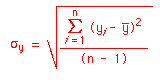
where  and
and  are the mean values of x and y respectively, sx
and sy are the standard deviations of
the data, and n is the number of data points:
are the mean values of x and y respectively, sx
and sy are the standard deviations of
the data, and n is the number of data points:

r can take on any value between -1 and 1. If r is positive, then the
data are positively correlated. This means that an increase in variable
x corresponds to an increase in y, whose magnitude depends on the slope
of the line drawn on a plot of y vs. x. If r is negative, then the data
are negatively correlated: an increase in variable x corresponds to a
decrease in variable y, again with magnitude depending on the slope of
the line drawn through the data. If r=0, then there is no relationship
between the data y and x: we can't make any prediction about how y should
change if we vary x. In practice r almost never exactly equals -1, 0 or
1, but falls somewhere in between. Then we have to decide whether there
really is any relationship between y and x. It would help to know
something about the problem itself, such as its physics, to interpret and
explain the correlation coefficient. The correlation coefficient itself
says nothing about causality, however: it merely suggests whether changes
in x are associated with changes in y (or the other way around).
Are SST anomalies in the eastern equatorial Pacific
associated with sea level pressure anomalies across the tropical Pacific?
We'll investigate this question by computing the correlation between NINO3
and an index of anomalous atmospheric sea level pressure difference between
the eastern and western tropical Pacific, called the Southern Oscillation
Index. NINO3 is the average SST anomaly over the region 150W to 90W, 5N to
5S. (From the map views of SST anomaly, you can see that this region has
the strongest SST anomalies associated with ENSO warm phase events.) The
SOI is the difference between the atmospheric sea level pressure anomaly at
Tahiti (in the southeastern tropical Pacific), and the atmospheric sea
level pressure anomaly at Darwin, Australia (in the western Pacific).
Pressure is usually low in the western tropical Pacific, and high in the
eastern tropical Pacific. (From lecture, can you explain why, given the
pattern of sea surface temperatures across the tropical Pacific?) The SOI
tells us when this atmospheric pressure pattern departs from normal
conditions, or in other words, when atmospheric sea level pressure is
simultaneously lower in the eastern tropical Pacific, and higher in the
western tropical Pacific.
Save the data in a place you can easily access
(e.g., the Desktop). There are three columns of data. The first is the
year: notice the data are averaged for April through March of the following
year. The second column is the NINO3 annually-averaged SST anomaly for the
corresponding years, and the third column gives like averages of the SOI.
First make a scatter plot of NINO3 vs. SOI. Do you see a negative or
positive correlation? Weak or strong? Try to estimate the correlation on
a scale from 0 to 1 (0 to -1 for negative correlation).
Compute the correlation between SOI and NINO3 using Excel's =correl()
function.
Is the correlation positive or negative? Weak or strong? Your eye was
probably pretty accurate at judging the strength of the correlation.
Is the correlation between NINO3 and SOI really different
from zero?
If we don't know anything about the physics (or even if we do), we still
would like to test the reality of the relationship between NINO3 and SOI. Is
it really different from zero? Typically a statistical test is phrased as
follows. We obtained a value r for the correlation coefficient between the
variables x and y. Suppose instead of the series y, we had a series z of
randomly chosen numbers. In this case, what value of correlation coefficient
would you expect -- what is the most likely value for the correlation
between x and z? We want to know the likelihood that we obtained a
correlation as high as r. If the probability that we obtained a correlation
as high as r by correlating x and z is low, then we are pretty sure the
relation between x and y is significant -- that is, that the relationship we
observed is not likely to be due to chance. If the probability is high,
however, then we can't be confident that there is a real relationship
between x and y.
We took the time series of annual averages of NINO3 SST anomaly for
1961-1990 (30 years) as x, and generated 10,000 random time series of 30
numbers each -- these are our z's. Here is a histogram showing the
number of observations of the magnitude of r between 0-0.1, 0.1-0.2,
0.2-0.3, etc. For instance, reading from the histogram, there were 4039
occurrences of |r| between 0 and 0.1. (The bars around r mean
"absolute value of".)

What is the median of r (i.e. the value of r where half the data has
higher r, and half the data has lower r)? What percentage of the
values fall between 0.4 and 0.5? What percentage of values of r is
less than 0.1? 0.2? 0.3?...1.0?
Now recall the correlation between SOI and NINO3 that we calculated
earlier. What percentage of the correlations between NINO3 and the random
time series is less than the correlation between SOI and NINO3? What
percentage is greater than the correlation between SOI and NINO3? This
percentage is the chance that a random time series will be correlated as
well with NINO3 as SOI is correlated with NINO3. How confident are you
that the correlation between SOI and NINO3 is real?
Relationships between NINO3 SST anomaly and agricultural yields
The atmosphere has to get rid of the extra heating supplied by the eastern
tropical Pacific Ocean during an ENSO warm phase event. It does this in
certain preferred patterns, which affect temperatures and precipitation in
many places around the world. As a result, weather-sensitive human
activities, such as agriculture, can be adversely affected. In this part
of the lab, we'll examine how closely Eastern Equatorial Pacific SST
anomaly is associated with remotely-located agricultural yields. We'll do
so by examining the correlation between NINO3, and selected crop yield time
series.
Now consider the following data table which
gives annual NINO3 SST anomaly, and crop yield anomalies for rice and maize
in India, the U.S. and Peru. The first column gives the year. The second
column gives the same NINO3 data as in table 1. The next columns are
agricultural yield anomalies (difference from the 30-year mean value). The
third column is annual rice harvest in India, the fourth is annual maize
harvest in the United States, and the final column is the annual maize
harvest for Peru.
Make scatter plots and compute the correlation between NINO3 and
a) annual rice harvest in India,
b) annual maize harvest in the United States, and
c) annual maize harvest for Peru.
Are the correlations positive or negative? weak or strong? Based on comparison
with the correlations obtained for NINO3 SST anomaly with random time series,
how confident are you of the reality of these relationships?
Why would SST anomalies in the Pacific be related to crop yield elsewhere?
Given a prediction of a high/low NINO3 anomaly, what advice would you give
to farmers in the US, India, and Peru? In all cases, how would you explain
why they should listen to you, based on your analysis of the data? Include
a sketch to support your answer.
Lab Report Instructions
Write a lab report (as per the Lab Report
Format) summarizing the major findings of your investigation.