Analyzing your Data
We can touch upon only a very small subset of data analysis tools
and types of graphs in this brief lecture. You may need to use a
specific tool for your project; please discuss this with your advisor
and research mentor!
Language note: the word “data” is plural. For example, it is
wrong to say (and write) “this data shows that…”. You should say “these
data show that…”. If you want to refer to a collection of data, you can
say “this dataset shows that…”.
Organizing and Understanding Your Data
- Types of measurements:
- Nominal or categorial, e.g., ‘Male’,
‘Female’.
- Ordinal or ranked, e.g., ‘Low’, ‘Medium’,
‘High’.
- Interval or continuous, e.g., 2.9, 4.2, 3.8.
Visit http://web.uccs.edu/lbecker/SPSS/scalemeas.htm
for a good primer on these concepts. They affect what kinds of
statistical analysis you will use.
- Types of variable:
- Dependent: the variable(s) you are interested in
being able to explain and/or predict.
- Independent or predictor: the variable(s)
you believe might affect the value of your dependent variable(s).
A statistical model is a particular combination of predictor variables
that you create as a candidate to explain the variation in one or more
dependent variables. Statistical analysis is really about choosing the
‘best’ explanatory model.
Recording,
Summarizing, and Curating Your Data
The data you have gathered (or will
gather) for
your thesis is likely to come in many different forms depending on your
individual project. However, there are
some guidelines that are broadly applicable to everyone.
At some point you are likely to enter
your data
from its original format (field forms, lab notebook, etc.) into a
computer
spreadsheet. Think carefully about the
best way to arrange your data and keep the raw data together in a
master
file. Give this file a clear an
obvious name. You will likely make
several modifications to this file (which you should save as different
files)
but you should always have an unaltered master file with just the raw
data.
As you work with your data, you
will manipulate
it in several ways. You will almost
certainly make summaries (calculating means, frequencies, etc.),
examine
subsets of data, and manipulate the data to accommodate particular
kinds of
analyses. You will make your life
remarkably easier if you keep a log of your manipulations and analyses. If you spend an hour working with your data,
take a few minutes to journal what you have done (either in a notebook
on in a
dedicated computer file). It is
important to record what you did, why you did it, what the results
were, and
what new files you generated as result.
Since you will spend a significant amount of time with your data
over
the course of writing your thesis, taking a few minutes to record your
incremental progress will save you time down the line.
Some specific points:
- Keep your data
chains
short.
As much as possible, derive any subset datasets directly from your
master file,
so that any changes to the master have to propagate only one step.
- Use live links for
your summaries.
Excel (for example) allows you to link cells together with
formulas. Often, you can generate the summaries, subsets and graphs you
want
using formulas that link to the master dataset. Then, if you change the
mater,
everything else changes automatically.
- Give your files
meaningful
names.
Saving
files as thesis.xls and summary.xls will not tell you at a glance what
a
particular file is about. Use a few
keywords in your file name to keep data organized (e.g.
SiteA_logtransform.xls).
- Metadata. Metadata are ‘data
about data’; information on how the data were acquired, what the codes
mean,
etc. You should record all of this metadata on a separate worksheet
associated
with the master file. As you make new
datasets, make sure you take the time to update the associated metadata. For example, if you log transform you
data
and save it as a new file, be sure to update your metadata to include
any new
column heading. You may want to keep
the relevant parts of your analysis log on the same page as the
metadata.
Frequently used basic statistical analyses
- Basic summary statistics,
min, max, average.....
- Please report your data with uncertainties (standard deviation, standard error,
confidence inteval)
- Simple linear regression
can be used to determine a straight-line equation describing the
average linear relationship between two variables. MS Excel makes this
very easy by allowing you to plot the data and then use the trendline command to fit a line to
the data. However, the trendline equation or the R2
does not tell you if indeed there is a significant correlation between
the two parameters. For an answer to this question you'll need to
perform a statistical analysis using the regression tool in the Tools/Data Analysis menu. If this option does
not appear in your Tools menu, you need to install the analysis toolpak & toolpak VBA
under Addins.
A special case of a linear regression is a calibration curve
- A ttest is used to
compare the mean of two populations. Again, ttests can be found under
the Tools/Data Analysis menu. There are paired and
unpaired ttests.
- Chi-square tests – Matt?
(if necessary)
- ANOVAs - Matt
Graphics
Types of plots (This is not an exhaustive list)
- Y versus X scatter plot: simple line or symbol plot.
- Time series: data points are plotted versus time
- Linear regression: scatter plot plus best fitting trend
line
- Moving average: data are averaged in blocks around a
central point, (for example 10 points on either side of a given point).
Makes the most sense for time series data with large amounts of
variability. Problems: data points at the very end and start of the
time series cannot be included.
- Residual plot: (a fitted trend line, e.g., from a linear
regression, is subtracted out, so that only the differences between the
trend and the data are plotted).
- Pie chart: good for displaying data that should add up
to 100%.
- 3D plots: if you have measurements that depend on two
other variables, you could plot the measurements as ‘heights’ (z
values) on a ‘landscape’ of the variables (x and y
values).
- Log-log or semi-log plot: used for displaying data with
large ranges in the numbers (for example, data points that range from 1
to 1000). Problem: can obscure serious errors in the data.
Characteristics of Good Plots, Figures, and Tables
A key feature of good scientific communication is making good figures
and plots. Many more readers will see your figures and plots than will
ever read the text of the paper.
- Symbols are legible and distinctive. The symbols are large
enough to view and distinguish if the page is held at arms length.
- Lines connecting symbols are legible and distinguishable (where
possible).
- Every figure has a figure caption that explains the overall
purpose of the figure and the meaning of every symbol and line on the
figure, if no legend was included in the figure.
- The plot is not overly busy. Too many symbols and lines on
one plot are simply confusing.
- Where appropriate, symbols should have error bars.
- If a title of the plot is included, it does not repeat
information already included in the plot.
- A good plot would be legible if it was shrunk down onto a 3 by 5
index card. This is also true for a good table.
- Tables are difficult to display in talks, but are vital for
papers. They can compress information and avoid boring, repetitious
discourse. They can also help to keep you organized. Tables for talks
should be VERY simple.
- Try stacking plots that are related to avoid overly busy, single
plots.
Avoid becoming a graphical sinner!
- Do not use numbers or graphs in such a manner that — either by
intent, or through ignorance or carelessness — the conclusions are
unjustified or incorrect!
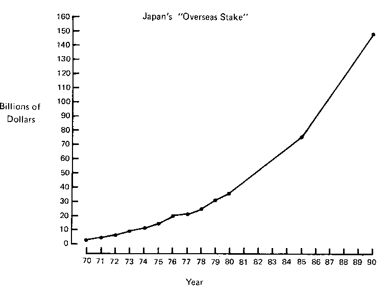
- Example: “Soaring overseas stake of Japan’s multinational
companies” (from Business Week, June 16, 1980; after Jaffe and Spirer,
1987) (Fig) and redrawn with a
consistent scale on the horizontal axis (Fig).
- Example: “Birthrate soars in decade,” Birthrate expressed in per
1000 and year (Fig).
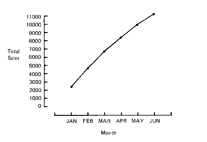
- Depressing monthly sales (Fig)
and encouraging cumulative sales (Fig).
Technical issues
- Back up your data.
- There are many software packages out there that allow to make
more or less sophisticated plots.
- MS Excel is limited but does cover most of the data analysis/plotting tasks that you need to
perform (you may have to add the data analysis tool pack as an "Add
in").
- You can make simple figures (sketches, flow charts, etc...) in
MS Word/PowerPoint by using the drawing tool bar at the bottom
of the window.
- All kinds of figures created in other programs can be
incorporated in MS Word/PowerPoint. Include a figure caption!
- Back up your data.
- If you want to use scanned images, the resolution of your image
should be ~200dpi at the size they will be ultimately printed. For PPT
presentations a typical projector has a resolution of 1024x768 pixels.
Depending on how much area your image is covering, you should scale
your image size accordingly. Save photo-type images as JPG files, and
diagram-type images (few colors, sharp transitions) as GIF files.
- Use the ‘Paste special’ option and paste images as 'Picture
(enhanced Metafile)'.
- In order to reduce file sizes, unclick the ‘fast save’ option in
the Tools/Options menu in MS Word/PPT.
- Find out what the size limit is of your e-mail sevice provider.
Sending e-mails > 3MB often is problematic.
- Did we mention… Back up your data!
Where to find help
- Statistical Consulting Services - The Department of
Statistics at Columbia University
- Statistical advice at any stage of research (sorry no help
on homework problems or class projects).
- You are encouraged to come in during the early stages of
your research so consultants can be helpful at the design stage.
- contact:
- Statistics software packages
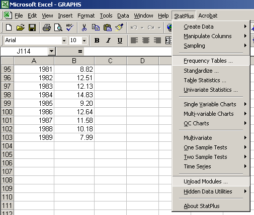
- Statplus
- This is a non-MS add-in for EXCEL that you are welcome
to use on the Env. Sci. Department computers and on BC computer lab
machines
- You can explore some of the concepts mentioned above in
short Excel tutorials:
- SPSS - available on many lab computers
- Help files/tutorials
Resources
- Gotelli, N.J. and A.M. Ellison. (2004) A Primer of
Ecological Statistics. Sinauer Associates, Sunderland, MA. 510 pp.
- Jaffe, A.J., and Spirer, H.F. (1987) Misused statistics. Marcel
Dekker, Inc., New York, 237pp. (HA29.J29 1987)
- Berk K.N. and Carey, P. (2000) Data Analysis with Microsoft
Excel. Duxbury, Pacific Grove, CA, 587pp.
- EESC
3017 Environmental Data Analysis
- Example spreadsheet (graphs.xls)