West Point, NY Ozone Data
General Problem: Why did West Point experience ozone levels above 100 ppb in the summer of 1993?
Tip 2: LOOK AT YOUR DATA!
- Always inspect the table of numbers themselves:
- Try to understand the general 'style' of the way the data are organized
- Look for oddities in the presentation (e.g. letters in columns that
ought to contain numbers, etc.
- Get a feeling for the precision (e.g. number of decimal places)
of each measurement.
- Make preliminary plots of the data, just to see what it looks like. Look at
- the overall variability of measurements
- the amount of scatter or noise
- Don't just shove the data into a computer program to calculate some ANSWER. A lot of nonsense has been produced by using data inappropriately!
Some general remarks:
- In case you have to plot several parameters as time series, place the graph above each other, so that correlations are easier to recognize.
- Put the date of `your' day somewhere on each plot.
- Save paper, put several plots on one page. Do a `print preview' before you print.
- Decide if you want to leave the `problematic' data points on your plot or not.
- Use metric units.
Things to do:
Session 1: Familiarization
- Read over the ozone summary.
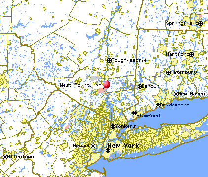
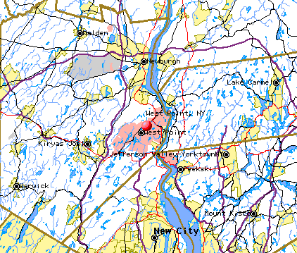
- Familiarize yourself where West Point, NY is (Regional Map,
Close-up Map). Where are nearby urban areas? You may want to check out the satellite image of the US at night
- Familarize yourself with the ozone data. Be sure
that you understand the quantities in each of the columns of the table, and
their units.
- Date, in mm/dd/yyyy format.
- Time, in twenty-four hour format.
- Date and Time , in mm/dd/yyyy hhhh format. Why is the date column repeated? Does it
match columns 1 and 2 exactly?
- Precipitation, in inches.
- Precipitation, in millimeters.
- Wind Direction, in degrees east of north.
- Wind Speed, in meters per second.
- Temperature, in deg C.
- Delta Tempemperature, in degrees C. Delta Tempemperature is temperature at 2 meters elevation minus the
temperature at 10 meters elevation. It indicates whether a temperature
inversion is occuring.
- Relative Humidity, in percent.
- Ozone Concentration, in parts per billion.
- Solar Radiation, in Watts per meter squared
Session 2: Describing the data.
- Supplement the date and time columns with a 'total elapsed hours' column
(say column 13), that starts at zero and increases throughout the dataset. This column will be helpful for plotting purposes. Add a column 14 with a 'total
elapsed days' column, by dividing column 13 by 24. What is the largest
time gap in the data?
- Plot Column 4 (precipitation, in inches) against time. How would you
describe the shape of the graph. How much precipitation is there on a
typical day? How much rained occured on the wetest day?
- Check that the conversion factor between columns 4 (precipitation, in inches)
and 5 (precipitation, in millimeters) is correct.
- Wind direction (Column 6) should vary between 0 and 360. Check that it
does. From what directions does the wind typically blow (use a
histogram).
- How fast is the strongest wind speed (Column 7), expressed in miles per hour?
- Plot Column 7 (Wind Speed) against time. How would you describe the
shape of the curve? Is wind speed cyclic? If so, with what period?
- Plot Column 8 (Temperature) against time. How would you describe the
shape of the curve? Is temperature cyclic? If so, with what period?
- What is the minimum, maximum and average temperature during the overall
period of observation?
- Plot Column 9 (Delta Temperature) against time. How would you describe the
shape of the curve? Is Delta Temperature cyclic? If so, with what period?
- Check that Relative Humidity (column 10) is always between 0 and 100%.
- Plot Column 10 (Relative Humidity) against time. How would you describe the
shape of the curve? Is Relative Humidity cyclic? If so, with what period?
- Suppose that the classroom had an ozone concentration of 112 ppb. If all
the ozone were gathered in one part of the room, what would its volume be?
- Plot Column 11 (Ozone) against time. How would you describe the
shape of the curve? Is Ozone Concentration cyclic? If so, with what period?
- Plot Column 12 (Solar Radiation) against time. How would you describe the
shape of the curve? Why are some peaks higher than others? Is the sun
brighter on some days than others? Is Solar Radiation cyclic? If so, with
what period?
- How can you have a negative Solar Radiation (Column 12).
Session 3: Investigating variability in the data as a
function of time (ie. as time-series).
- Overlay plots of the ozone time-series onto plots of the
other time-series (temperature, etc.). Which does it match most
closely in overall shape?
- Compare the detailed shapes of the daily ozone and solar radiation
peaks. Is there a difference between the time of the ozone maximum and
the solar radiation maximum? How does the pattern of ozone concentration
relate
to solar radiation?
- How does the wind direction vary over the course of the day? Are changes
in the wind direction related to changes in the wind speed? How can you
explain these variations?
Session 4: Investigating correlations between different
parameters using scatter plots).
- Use scatter plots to examine the way in which solar radiation, temperature
and relative humidity are correlated. Quantify the
correlations with a
correlation coefficient. How can you explain these trends?
- Use a scatter plot to examine the way in which ozone concentration
varies with wind direction. How can you explain the behavior?
- What are the wind directions during the time of highest ozone levels?
- The National Research Council states that high ozone levels are associated
with low winds, so that little mixing occurs. Is this the case here?
Session 5: Summarization.
- Use this session to work on your lab report.