Plotting and Manipulating Your Data
A key feature of good scientific communication is making good figures and
plots. Many more readers will see your figures and plots than will
ever read the text of the paper. PLease note: we can touch upon only a
very small subset of data analysis tools and types of graphs in this brief
lecture. You may need to use a specific tool for your project - please
discuss this with your advisor and research mentor!
Types of Plots (This is not an exhaustive list).
-
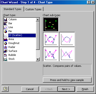
Y versus X- scatter plot, simple line or symbol plot.
-
time series- data points are plotted versus time
-
linear regression plot- scatter plot plus best fitting trend line
-
moving average- data are averaged in blocks around a central point,
(for example 10 points on either side of a given point). Make
the most sense for time series data with large amounts of variability.
Problems: data points at the very end and start of the time series cannot
be included.
-
anomaly plot (the average trend is subtracted out- only the differences
between the average and the data are plotted)
-
pie chart- best for displaying data that should add up to 100%
-
maps - X-Y-Z plot
-
log-log plot or semi-log plot - used for displaying data with large
ranges in the numbers (for example, data points range from 1 to 1000).
Problem: can obscure serious errors in the data.
Characteristics of Good Plots, Figures, and Tables
-
Symbols are legible and distinctive. The symbols are large enough
to view and distinguish if the page is held at arms length.
-
Lines connecting symbols are legible and distinguishable (where possible).
-
Every figure has a figure caption that explains the overall purpose of
the figure and the meaning of every symbol and line on the figure, if no
legend was included in the figure.
-
The plot is not overly busy. Too many symbols and lines on one plot
are simply confusing.
-
Every symbol should have a size that is bigger than its error limits OR
the symbol should have error bars.
-
If a title of the plot is included, it does not repeat information already
included in the plot.
-
A good plot would be legible if it was shrunk down onto a 3 by 5 index
card. This is also true for a good table.
-
Tables are difficult to display in talks, but are vital for papers.
They can compress information and avoid boring, repetitious discourse.
They can also help to keep you organized. Good tables for talks
should be VERY simple.
-
Try stacking plots that are related to avoid overly busy, single plots.
Technical issues
-
There are many software packages out there that allow to make more or less
sophisticated plots.
-
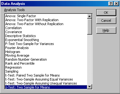
MS Excel is limited but does cover most of the data
analysis/plotting tasks that
you need to perform (you may have to add the data analysis tool pack as
an "Add in").
-
You can make simple figures (sketches, flow charts, etc...) in MS Word
by using the drawing tool bar at the bottom of the window.
-
All kinds of figures created in other programs can be incorporated in MS
Word. Include a figure caption!
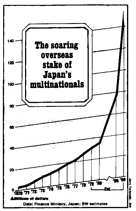
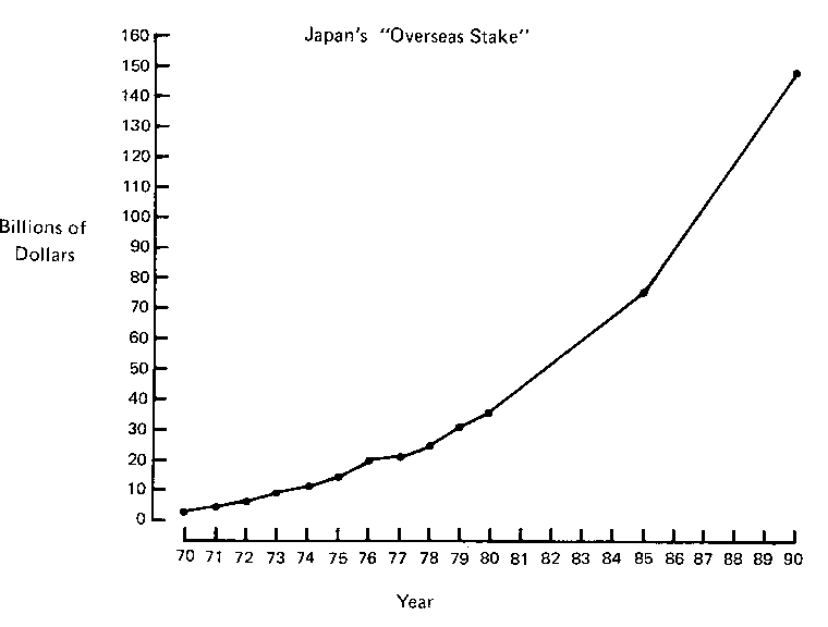
Avoid becoming a graphical sinner!
-
Do not use numbers or graphs in such a manner that - either by intent,
or through ignorance or carelessness - the conclusions are unjustified
or incorrect!
-
Example: "Soaring overseas stake of Japan's multinational companies" (from
Business Week, June 16, 1980; after Jaffe and Spirer, 1987) (Fig)
and redrawn with a consistent scale on the horizontal axis (Fig)
-
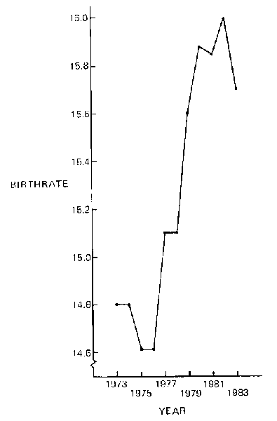
Example: "Birthrate soars in decade", Birthrate expressed in per 1000 and
year (Fig)
-
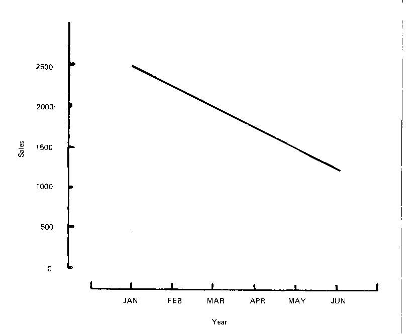
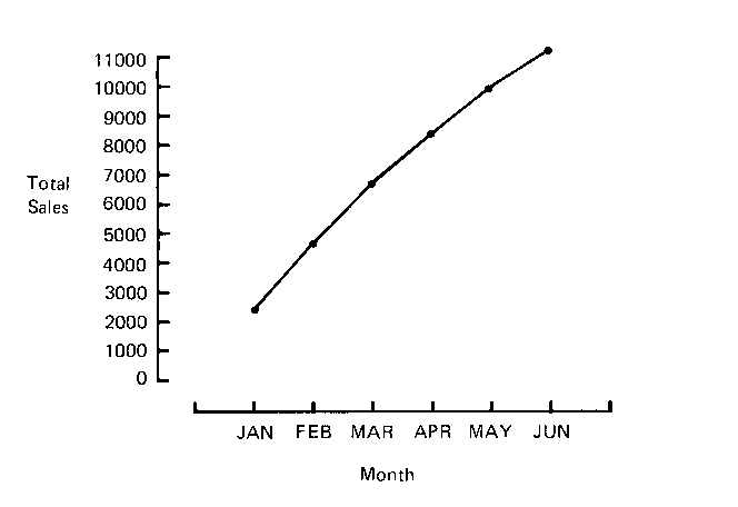
Depressing monthly sales (Fig) and encouraging
cumulative sales (Fig)
Resources
Jaffe, A.J., and Spirer, H.F. (1987) Misused statistics. Marcel Dekker,
Inc., New York, 237pp. (HA29.J29 1987)