When working with multiple data sets, overlapping swath files, and new survey data, repeatability is a helpful measure of the performance of the sonar and the quality of the data set. When preparing data for publication, swath data is often first processed by a gridding algorithm to create a regular distribution of data points with gaps filled by interpolation and errors removed. It is therefore helpful to know something about the density and regularity of a gridded data set. mbm_grid can help us to do this.
For this example we can use the R/V Ewing survey data found in mbexamples/cookbookexamples/otherdatasets/ew0204survey/.
To start, we create a grid with mbm_grid much like has been demonstrated elsewhere in the text, however this time we can specify the "-M" option. This option causes mbgrid to output two additional scripts which will, in turn, produce two additional grids. The first grid will display the number of data points located within each bin, and the second, the standard deviation of those data points. Lets try it out.
mbm_grid -F-1 -I survey-datalist -M

Grid generation shellscript <survey-datalist_mbgrid.cmd> created.

Instructions:
  Execute <survey-datalist_mbgrid.cmd> to generate grid file <survey-datalist.grd>.
Here mbm_grid has done all the difficult work in figuring out appropriate bounds and grid spacing and then creating script for us to execute. So now we can simply execute it:
./survey-datalist_mbgrid.cmd

Running mbgrid...
A load of information will go by here before you get the chance to look at it closely. First you'll see details regarding the input files, the type of gridding that's been chosen, the grid bounds and dimensions, and the input data bounds -- all details that mbm_grid has taken care of for you automatically. Then you'll see processing of the swath bathymetry data files, and some information regarding the number of bins and their statistics. After that, you'll see details regarding a secondary script that has been generated to create the bathymetry grid. This first section will end with something like this:
Plot generation shellscript <survey-datalist.grd.cmd> created.

Instructions:
  Execute <survey-datalist.grd.cmd> to generate Postscript plot <survey-datalist.grd.ps>.
  Executing <survey-datalist.grd.cmd> also invokes ghostview to view the plot on the screen.
But wait, there is more! You'll see two more sets of plot details and instructions to run two more scripts that will generate the "number of data points per bin" and "standard deviation" plots. These will all likely speed pass you, so the "Instructions" lines are reproduced here:
...
Plot generation shellscript <survey-datalist_num.grd.cmd> created.

Instructions:
  Execute <survey-datalist_num.grd.cmd> to generate Postscript plot <survey-datalist_num.grd.ps>.
  Executing <survey-datalist_num.grd.cmd> also invokes ghostview to view the plot on the screen.

...

Plot generation shellscript <survey-datalist_sd.grd.cmd> created.

Instructions:
  Execute <survey-datalist_sd.grd.cmd> to generate Postscript plot <survey-datalist_sd.grd.ps>.
  Executing <survey-datalist_sd.grd.cmd> also invokes ghostview to view the plot on the screen.
Now we can execute the three new scripts. For the sake of brevity, and because we've seen this before, we will just show the results. First the gridded data set:
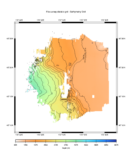
The default selections made by mbm_grid have produced a nice grid as we would expect. Now let us look at the data density plot.
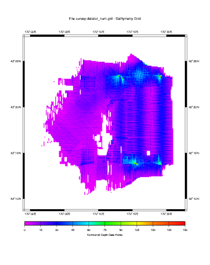
Here we see a density plot representing the number of data points in each bin. The highest data density is invariably directly beneath the ship, in shallow water and where turns cause subsequent pings to overlap. Conversely, the lowest data density occurs in the deepest water where the beam angles spread the data points so far apart that even an overlapping ship track does not greatly increase the data density in any given bin. Let us turn now to the standard deviation of the data in each bin.

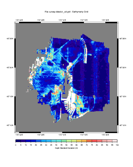
This is a fascinating plot, and there are loads of things to point out.
First, we must consider that this data has not at all been post processed. So much of the large variability is due to outliers that would normally be eliminated. But keeping them in for this example is instructive, because it makes obvious where sonars have a difficult time. In our plot we have a large variability where the sonar is attempting to look over the edge and down a large escarpment. The real bottom has likely been shadowed by the higher edge, and that combined with the fact that most of the sound energy is deflected away from the ship at such steep angles,\ results in poor depth estimations by the sonar system. In this case some of the data points differ by as much as 1000 meters. The left side of the plot shows a similar effect, this time in deeper water, but also where the sonar is looking down a large slope. Here the data points appear to differ by as much as 500 meters.
Also notice the blue streak down the center of the plot. You'll note that it abruptly ends at about 42:21N Latitude. This kind of abrupt change results from watchstander adjustments of the sonar's operating parameters. In this case, the ship had just passed over a 3000 meter sea cliff. It is likely that some combination of the bottom detect window and source level were adjusted to produce better quality data in the shallower water. If you are lucky, when you see this you will have a watchstander's log book that will tell you exactly what changes were made.
It is also apparent from this plot that there is less variability in the sonar data for beams that are more directly beneath the keel. We know to expect this from the theory chapter, as errors in the sound speed at the keel and the sound speed profile will be exacerbated in the outer beams.
The plot also demonstrates that the generally produces poor data during turns. This is particularly evident in the fan shaped figures near the bottom center of the plot.
Since we did not edit this data before gridding it and conducting this analysis, it would be interesting to look more closely at the variability of the data points closer to zero. This would give us a view of the variability in the data had we done some post processing and removed the outliers that result in such large variability in this plot.
To do this we need to create a new color table to cover a smaller range of values. We can then edit the script that created this plot to use the new table and create a new plot. In this case, we'd like a new color table to cover the range of points from 0 to 100 meters in 5 meter increments. We can create the new color table with a GMT command makecpt. Here's how it works:
makecpt -Chaxby -T0/200/10 > survey-datalist_sd.grd.cpt
Here we've specified the "Haxby" master color pallette. We've then specified bounds (0-200) and an increment (10) which will be used to map the master color pallette to our new color table. We've redirected the output to a file of the same name that the survey-datalist_sd.grd.cmd script uses for its color table.
The resulting color table file contains:
#       cpt file created by: makecpt -Chaxby -T0/100/5
#COLOR_MODEL = RGB
#
0       10      0       121     5       10      0       121
5       40      0       150     10      40      0       150
10      0       10      200     15      0       10      200
15      0       25      212     20      0       25      212
20      26      102     240     25      26      102     240
25      25      175     255     30      25      175     255
30      50      190     255     35      50      190     255
35      97      225     240     40      97      225     240
40      106     235     225     45      106     235     225
45      138     236     174     50      138     236     174
50      205     255     162     55      205     255     162
55      223     245     141     60      223     245     141
60      247     215     104     65      247     215     104
65      255     189     87      70      255     189     87
70      244     117     75      75      244     117     75
75      255     90      90      80      255     90      90
80      255     124     124     85      255     124     124
85      245     179     174     90      245     179     174
90      255     196     196     95      255     196     196
95      255     235     235     100     255     235     235
B       0       0       0
F       255     255     255
N       128     128     128
Our automatically generated plot script creates its own color table, and then deletes the file when it is done. So we need to comment out the lines that create the color table, and if we think we'll use our new color table again, we might want to save a copy so it does not inadvertently get deleted. Here are the lines to comment out:
# Make color pallette table file
echo Making color pallette table file...
echo      0 255   0 255    100 128   0 255 > $CPT_FILE
echo    100 128   0 255    200   0   0 255 >> $CPT_FILE
echo    200   0   0 255    300   0 128 255 >> $CPT_FILE
echo    300   0 128 255    400   0 255 255 >> $CPT_FILE
echo    400   0 255 255    500   0 255   0 >> $CPT_FILE
echo    500   0 255   0    600 128 255   0 >> $CPT_FILE
echo    600 128 255   0    700 255 255   0 >> $CPT_FILE
echo    700 255 255   0    800 255 128   0 >> $CPT_FILE
echo    800 255 128   0    900 255  64   0 >> $CPT_FILE
echo    900 255  64   0   1000 255   0   0 >> $CPT_FILE
#
Place "#" symbols before each echo statement above and save the file. Then give it a spin. The results will look like this:
By rescaling our color table, we have omitted the standard deviations that are greater than 100 meters, in this way we can more clearly see the variation less than 100 meters, and values greater than 100 meters produce white space.
Of the values that are plotted, these have been scaled against the Haxby color pallette shown in the scale bar at the bottom. This new scale allows us to see the changes in variability, if any, in the 0 to 100 range.
Here we can see that indeed, there is less absolute variability in the data collected in the shallow water. We know to expect this, since data accuracy is depth dependent - usually expressed as a percentage of absolute water depth. At depths of 4000 meters, even in very rough terrain, this plot rarely shows variability greater than 50 meters. That translates to about .1% error - a very low figure.
That brings up another step that we might have taken to more quantitatively compare this data. GMT provides a function called gridmath that would have allowed us to calculate the standard deviation as a percent of water depth. Without explaining the details, here is how it would be done:
# Do the math
grdmath survey-datalist_sd.grd survey-datalist.grd DIV 100 MUL \
   = survey-datalist_sd-percent.grd

# Generate the plot script.
mbm_grdplot -F survey-datalist_sd-percent.grd -G1 -W1/2 -V \
   -L'Standard Deviation as a Percent of Water Depth'
One final note, we would be remiss if we didn't point out that the lower data density at greater depths skews these statistics somewhat. To more accurately conduct this analysis, a data set with a more uniform depth profile should be selected with sufficient overlapping runs such that the data density per bin is large. Then the standard deviation of the binned data will provide a more statistically significant measure of the sonar's performance. None-the-less, our plot depicts a reasonable approximation.